Perfect for modern e-commerce brands, this template is built to highlight products, streamline navigation, and foster customer confidence. Whether you’re launching a new online store or enhancing an existing one, its responsive design ensures effortless browsing and smooth purchasing across all devices — helping convert visitors into loyal customers.
Link to Template
Shpo Website Template
🔗 URL: https://www.template-preview.site/?url=shpo
Summary
The Shpo Website Template is designed for e-commerce businesses, providing an optimized shopping experience across desktop, tablet, and mobile devices. With a modern and responsive design, it ensures seamless navigation, product showcasing, and customer engagement to drive online sales.
Desktop
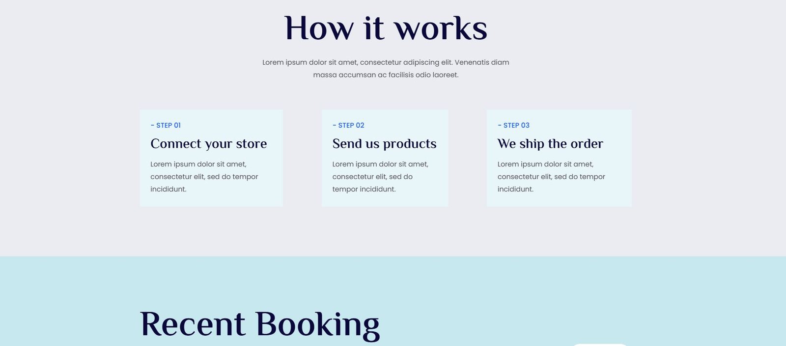
- Hero Section: Prominently displays the main value proposition with a compelling headline and subheadline.
- Product Showcase: Features a grid or carousel of products with images, descriptions, and prices.
- Categories: Offers navigation by product categories to help users find what they need.
- Testimonials: Includes customer reviews and ratings to build trust.
- Call-to-Action (CTA): Prominent buttons encouraging users to "Shop Now," "Add to Cart," or "Learn More."
- Footer: Contains links to important pages like About, Contact, Privacy Policy, and social media links.
Tablet
- Responsive Design: Ensures all content is visible and readable on a medium-sized screen.
- Simplified Layout: Streamlines the layout to focus on essential elements like the hero section and product showcase.
- Interactive Elements: Maintains interactive elements such as buttons and forms for easy interaction.
- Navigation: Uses a simplified navigation menu, possibly a collapsible menu, to save space.
Mobile
- Vertical Layout: Adapts the design to a vertical scroll format, making it easier to navigate on smaller screens.
- Simplified Navigation: Uses a hamburger menu or similar navigation pattern to keep the interface clean.
- Touch-Friendly CTAs: Ensures buttons and links are large enough to be easily tapped.
- Optimized Images: Uses optimized images to ensure fast loading times on mobile devices.
General Use Case
This template is ideal for e-commerce websites. It effectively showcases products, provides easy navigation, and includes features to build trust and encourage purchases. The responsive design ensures a seamless user experience across various devices, making it easy for visitors to browse, shop, and complete transactions.